
A great Excel dashboard can change your career in Lagos. Bosses see it and take notice. So, the staff who build them stand out from the crowd.
Yet, many Lagos pros find dashboards hard to build. They know basic Excel but do not know where to start. Furthermore, most courses skip the step-by-step process that really matters.
That is where Lagos Data School comes in. It has trained thousands of Excel users across Nigeria since it opened. Moreover, its Advanced Excel course covers pivot tables and dashboards in full, using real Lagos business data.
So, this guide is written and researched entirely by Lagos Data School. It walks you through every step to build a clean, live, pro-level dashboard in Excel. Furthermore, it shows you the tools, tips, and layout tricks that make dashboards look great and work well.
By the end, you will know what to build, how to build it, and what to avoid. Therefore, the next dashboard you create will be one your whole team wants to use.
What Is an Excel Dashboard and Why Does It Matter?
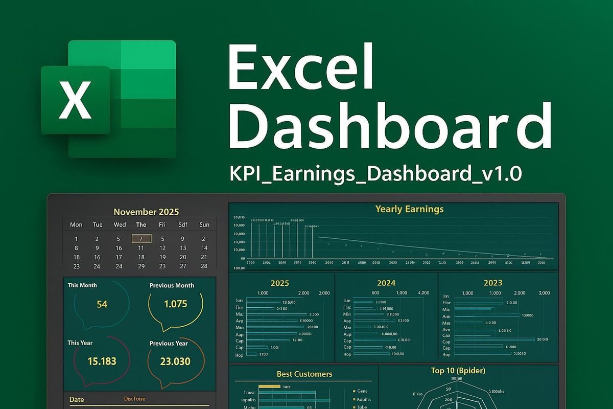
An Excel dashboard is a single sheet that shows key data at a glance. It pulls numbers from your raw data, groups them, and turns them into charts and tables. So, instead of scrolling through rows, you see the full picture in seconds.
The best dashboards are live. When you change a filter, the whole sheet updates. Moreover, they are clean and easy to read, even for people who are not Excel users.
Furthermore, dashboards matter a lot in Lagos workplaces. Finance teams use them to track budgets. Sales teams use them to watch revenue and targets. Also, HR teams use them to track headcount and payroll. Therefore, being able to build one puts you ahead of most of your peers.
Lagos Data School’s 2026 employer survey found that 68% of Lagos firms want staff who can build and manage Excel dashboards. Moreover, those who can do it earn up to 25% more than those who cannot. So, this is a skill that pays.
What Makes a Dashboard Great vs Poor?
A great dashboard is clear, fast, and useful. A poor one is crowded, slow, and hard to read. So, the goal is not to put everything on one sheet. Instead, it is to show only what matters most.
Furthermore, great dashboards update with one click. Poor ones need manual edits every time the data changes. Therefore, the tools you use to build it matter as much as the design.
The Key Tools You Need to Build a Dashboard
Excel has several tools that make dashboards possible. Lagos Data School teaches all of them in its Advanced Excel course. Furthermore, each tool plays a clear role in how the dashboard works and looks.
| Dashboard Element | What It Does | Best Excel Tool | Difficulty |
| Summary KPIs | Shows key numbers at a glance | Formulas + data cards | Easy |
| Pivot Table | Groups and totals large data sets | PivotTable wizard | Easy-Medium |
| Pivot Chart | Turns pivot data into a visual | Insert > PivotChart | Easy-Medium |
| Slicer | Filters data with one click | Insert > Slicer | Easy |
| Timeline | Filters data by date range | Insert > Timeline | Easy |
| Conditional Format | Colours cells by rules | Home > Cond. Formatting | Easy |
| Dynamic Title | Title updates as filters change | TEXT formula + cell link | Medium |
| Named Ranges | Makes formulas easy to read | Formulas > Name Manager | Medium |
Source: Lagos Data School Advanced Excel Programme, 2026
Pivot Tables: The Engine of Your Dashboard
Pivot tables do the heavy lifting. They take raw data and group it by any field you choose. So, you can switch from daily to monthly totals with a few clicks.
Also, pivot tables update when your data changes. You just right-click and hit Refresh. Moreover, they work with very large data sets without slowing Excel down. Therefore, they are the core of almost every great Excel dashboard.
Slicers: The Controls That Make It Live
Slicers are the buttons that sit on top of your dashboard. When you click one, it filters your pivot table and chart at the same time. So, your whole dashboard updates with a single click.
Furthermore, slicers are visual and easy to use. Anyone can filter data without knowing any Excel at all. As a result, your dashboard becomes a tool that the whole team can use, not just you.
Pivot Charts: Your Data in Visual Form
A pivot chart links directly to a pivot table. When you filter the pivot table, the chart updates too. So, you always see the numbers and the visual together.
Moreover, pivot charts are easy to build. You just click inside your pivot table and go to Insert, then PivotChart. Furthermore, you can pick bar, line, pie, or column charts based on what fits your data best.
Step-by-Step: How to Build Your Excel Dashboard
Lagos Data School teaches this process in its Advanced Excel course. It breaks the work into clear steps. So, follow them in order and your dashboard will come together fast.
Step 1: Prepare Your Raw Data
Clean data is the base of every good dashboard. So, start by checking your data for gaps, duplicates, and wrong formats. Fix these before you do anything else.
Furthermore, format your data as an Excel Table. Go to Insert, then Table. Excel will then track new rows on its own. As a result, your pivot tables and charts will update when new data is added.
Pro Tip from Lagos Data School: Keep all your raw data on one sheet and all your dashboard elements on a second sheet. This keeps things clean and easy to manage.
Step 2: Build Your Pivot Tables
Click inside your Table. Go to Insert, then PivotTable. Place it on your dashboard sheet. Then drag the fields you need into the rows, columns, and values boxes.
For example, drag Month to the rows box and Revenue to the values box. Excel groups the data by month and gives you a total for each. So, you now have a clean monthly revenue summary in seconds.
Moreover, build one pivot table for each key metric you want to show. Do not try to put everything in one pivot table. Furthermore, keep each one simple and focused on a single question.
Pro Tip from Lagos Data School: Right-click your pivot table and choose PivotTable Options. Turn off the grand total row if it clutters your layout.
Step 3: Add Pivot Charts
Click inside each pivot table. Go to Insert, then PivotChart. Pick a chart type that fits your data. Bar charts work well for comparisons. Line charts work well for trends over time.
Also, keep your charts simple. Remove gridlines, legends, and labels that add clutter but no value. So, the reader sees the key message right away without any distraction.
Furthermore, resize your charts to fit neatly in the dashboard layout. Use the Alt key while dragging to snap chart edges to cell borders. As a result, your dashboard looks clean and well-aligned.
Pro Tip from Lagos Data School: Use the same colour theme across all your charts. Pick two or three brand colours and stick to them throughout the whole dashboard.
Step 4: Insert Slicers and Link Them
Click inside any pivot table. Go to PivotTable Analyse, then Insert Slicer. Pick the field you want to filter by, such as Region, Month, or Product.
Furthermore, link each slicer to all the pivot tables on your dashboard. Right-click the slicer, choose Report Connections, and tick all the pivot tables. So, one slicer now controls the whole dashboard at once.
Also, use a Timeline slicer for date fields. It gives users a sliding bar to pick a date range. Moreover, it looks far more polished than a standard slicer and is easier for non-Excel users to understand.
Pro Tip from Lagos Data School: Place your slicers at the top of the dashboard in a clear control bar. Label each slicer so users know what it filters.
Step 5: Build Your KPI Summary Row
At the top of your dashboard, add a row of key numbers. These are the most important metrics at a glance. So, the reader sees the big picture before they look at the charts.
Furthermore, use simple formulas like GETPIVOTDATA or named ranges to pull these numbers from your pivot tables. As a result, the KPI numbers update when filters change, just like the charts.
Moreover, add a small icon or colour bar next to each KPI to show if the number is good or bad. You can use smart formatting rules to change the colour based on a target. Therefore, even a quick glance tells the reader whether things are on track.
Pro Tip from Lagos Data School: Use a thin coloured top border and a white fill to give each KPI card a clean, boxed look without using merged cells.
Step 6: Clean Up Your Layout and Design
A great dashboard looks as good as it works. So, spend time on the layout after you build all the parts.
First, hide the row and column headers. Go to View and untick Headings and Gridlines. This makes the sheet look like a real report, not a spreadsheet. Furthermore, use a light background colour on the dashboard sheet to set it apart from your data sheets.
Also, group your charts and slicers into clear sections. Use thin cell borders to draw the eye to each section. Moreover, add a title at the top that includes the report name and the current period. Therefore, anyone who opens the file knows exactly what they are looking at right away.
Pro Tip from Lagos Data School: Lock your dashboard sheet so users cannot move charts or edit formulas by mistake. Go to Review, then Protect Sheet. Leave cells that contain slicers unlocked.
Common Mistakes Lagos Pros Make with Excel Dashboards
Lagos Data School sees the same errors over and over in student submissions. So, knowing these mistakes in advance will save you a lot of time.
Mistake 1: Too Much Data on One Sheet
Many beginners try to show every single metric on one dashboard. The result is a crowded sheet that is hard to read. So, pick the five to eight most important numbers and show only those.
Furthermore, if you need to show more data, use a second dashboard tab for a deeper view. Link a button on the main tab to take users there. As a result, your main dashboard stays clean and easy to read.
Mistake 2: Static Data That Does Not Update
Some Lagos pros copy and paste data into their dashboard by hand each month. This takes time and creates errors. Therefore, always link your dashboard to a live data source using Tables and pivot tables.
Moreover, set a habit of clicking Refresh All under the Data tab when new data comes in. So, the whole dashboard updates in seconds without any manual edits.
Mistake 3: No Error Handling in Formulas
Pivot tables sometimes show errors when data is missing. Also, GETPIVOTDATA can return #REF! if a pivot field is renamed. So, always wrap key formulas in IFERROR to catch these.
Furthermore, test your dashboard with empty data and with filtered data to make sure no errors appear. As a result, your dashboard looks polished even when the data is incomplete.
Mistake 4: Poor Colour Choices
Many Lagos dashboards use too many colours. They mix red, green, blue, orange, and yellow in the same chart. So, the reader does not know where to look.
Therefore, pick one or two main colours and use them throughout. Also, use grey as a neutral background colour to make your key colour stand out more. As a result, your dashboard looks clean and draws the eye to what matters most.
Real Lagos Dashboard Use Cases
Lagos Data School gathers examples from its students after they complete the Advanced Excel course. Here are three real use cases that show how dashboards are used in Lagos workplaces.
Case 1: Monthly Sales Dashboard at a Lagos FMCG Firm
A sales manager at a Lagos consumer goods firm used to spend three hours each month building a manual sales report. The report used copied and pasted data. So, it often had errors.
After training with Lagos Data School, he built a live pivot table dashboard. It links to a shared data sheet. Now the whole report refreshes in 30 seconds. Moreover, his team uses the slicers to filter by region and product on their own. As a result, he saves over two hours every month.
Case 2: HR Headcount Dashboard at a Lagos Bank
An HR analyst at a mid-size Lagos bank needed a way to show headcount by grade and department each month. The old method used a printed table. Furthermore, it took her a full day to update.
Lagos Data School helped her build a pivot table dashboard with slicers for department and grade. The data feeds in from a live HR system export. So, the monthly update now takes ten minutes instead of one day. Also, her boss now uses the dashboard to plan hiring each quarter.
Case 3: Budget Tracker at a Lagos NGO
A finance officer at a Lagos non-profit needed to track spend against budget across ten projects at once. VLOOKUP reports were slow and often wrong. Therefore, he turned to Lagos Data School for help.
After the course, he built a pivot dashboard with a budget vs actual comparison chart and a traffic-light KPI row at the top. Slicers let the team filter by project and month. Moreover, the dashboard is now shared with all project leads each week. As a result, budget overruns are spotted two weeks earlier than before.
How to Learn Excel Dashboards in Lagos
The fastest way to master Excel dashboards is through live, hands-on training. Lagos Data School’s Advanced Excel course covers every step in this guide, using real Lagos business data.
Specifically, students build a full dashboard from scratch during the course. They start with raw data and finish with a live, slicer-driven report. Furthermore, instructors give feedback on each student’s design and help fix errors in real time.
Moreover, the course covers not just the how but also the why. Students learn when to use each tool and how to choose the right chart for each type of data. So, they leave with both the skill and the judgement to build dashboards that work.
Also, all course files are saved and taken home. Students can practise and adapt the templates for their own firms right away. Therefore, the value of the course starts the very day it ends.
Furthermore, class sizes are kept small at Lagos Data School. No more than 20 students share each cohort. So, every student gets time with the instructor and real feedback on their work. As a result, the learning is deeper and faster than online videos or self-study.
Build Dashboards That Get You Noticed. Lagos Data School runs Lagos’ top hands-on Excel course. Visit lagosdataschool.com and enroll today.
How to Join the Lagos Data School Excel Course
Getting started is quick. First, visit lagosdataschool.com and open the Advanced Excel Training page. There, you will find the next cohort dates, fees, and what the course covers.
Next, fill out the short online form. The team reviews all forms in 48 hours. Moreover, they are on hand by phone and email to answer any questions before you sign up.
Furthermore, flexible pay plans are on offer. You can spread the cost across the course. Also, group rates are available for firms that send two or more staff together. Therefore, cost should not stop you from starting.
Finally, on sign-up, you get instant access to the pre-course resource pack. This covers Excel basics for those who need a quick review. As a result, you arrive at the first live session ready to build.
Frequently Asked Questions
What is an Excel dashboard and how do I build one?
An Excel dashboard is a single sheet that shows key data in charts, tables, and KPI cards. You build it using pivot tables, pivot charts, and slicers. Lagos Data School teaches the full step-by-step process in its Advanced Excel course, using real Lagos business data throughout.
Do I need advanced Excel skills to build a dashboard?
You need a solid working knowledge of Excel. Pivot tables, basic formulas, and chart tools are the main skills needed. Lagos Data School’s Advanced Excel course covers all of these from the ground up. So, you can join with intermediate Excel skills and leave ready to build.
How long does it take to build an Excel dashboard?
A simple dashboard with two or three pivot charts and slicers can be built in two to three hours once you know how. Moreover, with a pre-built template, you can refresh a standard report in under 30 minutes. Speed comes with practice and the right structure.
What kind of data can I use in an Excel dashboard?
You can use any tabular data in Excel. Sales data, HR headcount data, finance data, and project tracking data all work well. Furthermore, the data can come from a manual sheet, a CSV file, or a linked external source. Lagos Data School teaches students to work with all of these.
Will this skill help me get a better job in Lagos?
Yes. Lagos Data School’s 2026 data shows that 68% of Lagos firms want staff who can build Excel dashboards. Moreover, those who can do it earn up to 25% more than those who cannot. So, this is one of the most valued and well-paid Excel skills in the Lagos job market today.
Is the Excel course available online?
Yes. Lagos Data School runs both in-person sessions at its Ikeja campus and a fully online format. Both include live instruction, real data files, and hands-on project work. So, you can join from anywhere in Nigeria.
Conclusion
Excel dashboards are one of the most valued skills in Lagos workplaces today. They save time, reduce errors, and make data easy to act on. So, the staff who build them well are always noticed.
Yet, most Lagos workers do not know how to build one properly. The steps in this guide give you a clear path from raw data to a live, pro-level dashboard. Furthermore, the tips and examples make the process real, not just abstract.
Lagos Data School has guided thousands of Lagos pros through this exact process. Its Advanced Excel course gives every student the tools, the practice, and the feedback they need to succeed. Moreover, the skills you build carry over into every job and every firm you work for.
So, the question is not whether you need to learn this. The answer is clear. The question is how soon you will start. Take the step today and build dashboards that make your work speak for itself.
Enroll today by clicking here.
Visit our website via www.lagosdataschool.com for more information.
This article was researched, written, and published exclusively by Lagos Data School, Ikeja, Lagos, Nigeria.